8 min read
11 UX Design Mistakes that Could Be Costing You Business
11 UX Design Mistakes that Could Be Costing You Business
There are certain rules you just don’t break. Making these UX design mistakes will wreak havoc on your customer’s experience.
UX design always effects the bottom line.
That’s because UX design is about so much more than making a digital product look attractive. Smart, effective UX design makes it as easy as possible for users to achieve desired results. Even the prettiest websites and apps can fail to convert visitors or retain users.
>> Not Just a Pretty Site: How Wow-Worthy Companies Leverage UX Design to Get Ahead
The list below identifies some very common UX design mistakes that inhibit frustration-free experiences with apps, websites or other digital products. These inadvertent and seemingly harmless roadblocks may be costing you business and your reputation.

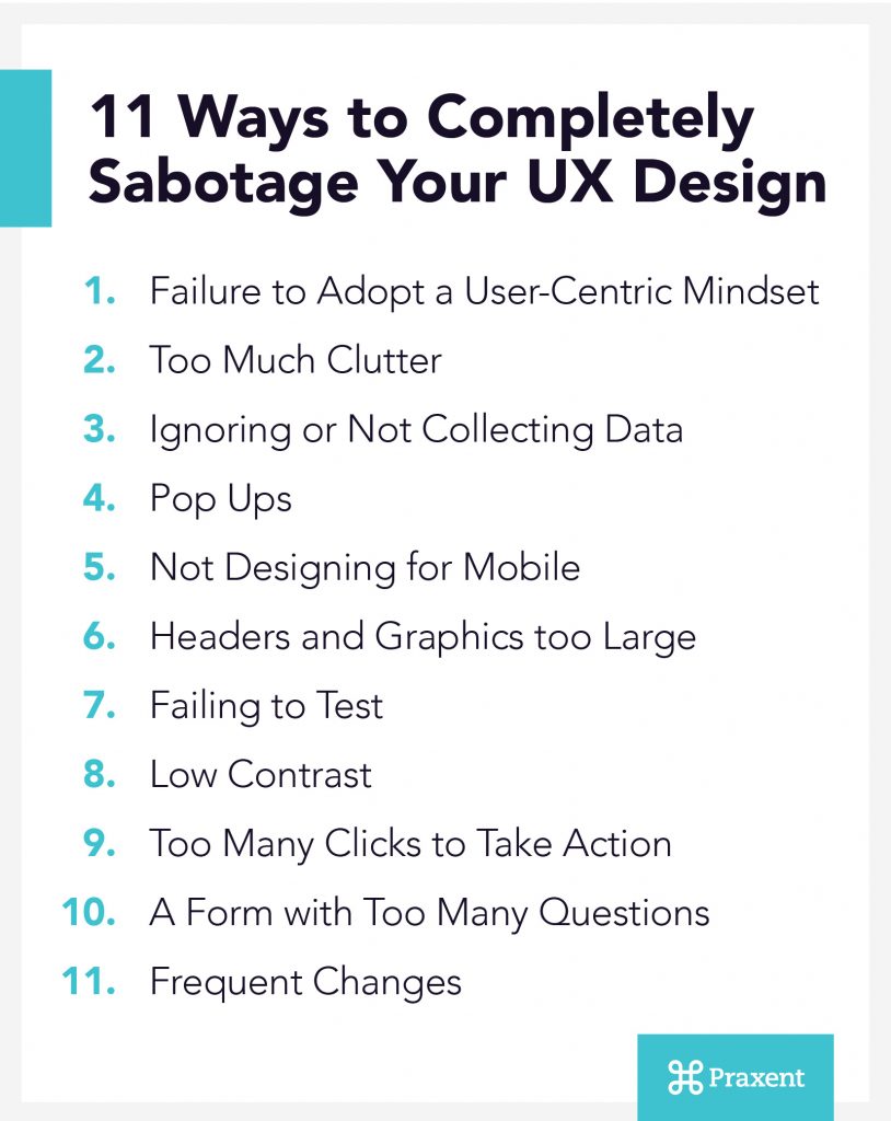
11 Ways to Completely Sabotage Your UX Design (In No Particular Order)
1. Failure to Adopt a User-Centric Mindset
Beware of designing your product in a way that makes things easier for you but harder for your customers. Good UX design works for the user — it makes their job easier, speaks their language and anticipates their needs. Among UX design mistakes, this is the hardest to overcome. Adopting a user-centric mindset requires more thought on your end, but it will pay off.
Focus on easing the workload for people using your digital product. One way to do this for website visitors is to incorporate interactive features. For instance, instead of simply listing a phone number, your mobile version could use a tap to call button. For e-commerce websites, streamline the ordering process with clear steps and minimal click-throughs.
For apps and other digital products, the entire concept should be geared toward solving problems for its users. For instance, don’t create a customer portal unless it satisfactorily addresses a pain point your customers are currently experiencing.
2. Too Much Clutter
When users are given too many choices, they may choose none. This is a psychological concept called the paradox of choice. If you’ve ever been in a fast-food restaurant and seen a customer exhibit frustration with the menu, you’ve seen this in action. When you have 25 different types of coffee to choose from, it’s overwhelming. The same goes for your digital product.
Avoid UX design mistakes resulting from a lack of clear vision. Make it easier for your customers to do what you want them to do. If you have popular items and choices, make those easier to find. Point your customers to the best value, don’t make them hunt for it.
3. Ignoring or Not Collecting Data
Analytics programs allow you to track the success of your website. You can know which calls to action and which forms have been successful. You can also find out what pages have the largest drop in users. This information will point you toward which problems need fixing.
At least some form of data-collection technology is available to all businesses. It’s critical to install analytics programs such as Google Analytics and use that information to make more informed decisions that will improve the user’s experience.
4. Pop Ups
We’ve all had this experience. We click on the link for an appealing article or web page and we’re interrupted by a pop up before we’ve even seen the content. Pop ups can be extremely intrusive to web users. They can render a mobile site nearly unusable.
If you must use pop ups, be sure to place them non-intrusively on the screen. It’s also a good idea to give people a chance to peruse the content they came for before hitting them with an interruption. If you give a reader some time to take their desired action, they may be more inclined to do what you are asking them to do.
5. Not Designing for Mobile
The number of mobile phone users worldwide is expected to pass five billion by 2019. It’s critical to build your website or app with these users in mind. It’s not enough to simply transfer your desktop versions onto a mobile platform.
Responsive design is a must. It allows mobile users the freedom and flexibility to get the optimal experience from desktops, laptops, tablets and phones.
6. Headers and Graphics too Large
In the newspaper world, the most important stories are placed “above the fold.” The idea is that the most compelling content is also the easiest to access. The same holds true for your website and software.
If branded logos, headers and other graphics require the user to do significant scrolling, it can detract from the experience and bury important content. Make sure that the artwork you choose to highlight fits the screen appropriately.
7. Failing to Test
Many UX design mistakes could be avoided with proper testing. That’s because there is more than one way to create a quality user experience. You’ll only know for sure which graphics, content, calls to action, forms or any other aspect of the experience work best for your users by testing them.
When you A/B test, make sure you only look at one issue at a time. If you introduce too many variables, it’s impossible to know what’s responsible for any changes.
8. Low Contrast
Readability is critical for any website or piece of software. If the contrast between the font and the background is too low, it becomes impossible to make sense of the message. This takes on even more importance if your audience is older.
UX design mistakes like this one are easy to fix. Try out a variety of color and font combinations and ask friends or colleagues for feedback on which ones are easiest to read.
9. Too Many Clicks to Take Action
Your users come to your site or download your app because they want something. If the path to what they’re looking for isn’t immediately obvious, that’s a problem. If they have to go searching through pages and sub menus before they find what they want, they may just give up.
Make sure that what they want is never more than a click or two away. This clarity makes all the difference in the world when it comes to getting your customer to act.
10. A Form with Too Many Questions
Sometimes your customer is in a hurry. They want to buy, download, or subscribe but the process is convoluted. It might be a good idea to take a look at the forms you’re asking them to fill out.
For instance, if nothing is being mailed or shipped, you probably don’t need a mandatory address field on your form. Perhaps you’ll ask a few questions to qualify your leads. But the shorter you can keep it, the more likely they are to fill it out. Make sure that everything you’re asking for is necessary.
11. Frequent Changes
Your website or app is an extension of your brand. Its design and performance will reflect either positively or negatively on your company. There is nothing wrong with testing features to see what brings you better results. However, when significant elements of the design change on a frequent basis, it can be a source of frustration for users.
This is especially true if the location of key features shuffle around. Maintaining a consistent look and feel gives your users a sense of stability.
Audit & Iterate: What You Think Is Working Might Actually Be Failing
Guilty of committing one or more of the above UX crimes? It may be time to do a design audit.
The list we’ve provided outlines the bare minimum requirements. But if you really want to create something that “wow”s, test your product with actual or potential users and implement their feedback. User research is the only way to know for sure what works and what doesn’t.
>> Discover ux design services that meet the needs of your business and your customers.


Leave a Reply