
4 min read
InsurTech UX Insights – Breaking Up Complex Insurance Forms

How to Break Up Complex Insurance Forms
to Increase Conversions

Doug Cooper
Product Designer at Praxent • 3 minute read
You see it in the analytics of your site every day. Customers peruse your marketing materials and are convinced your policy is worth purchasing. They start the purchasing process committed to the idea of getting a quote from you today. Then, after all that hard work to convert them into paying customers, they abandon your quote application halfway through filling it out. But why? What’s causing people to leave the purchasing process mid-stream? And what can we do to fix it?


INDUSTRY
Insurance

CATEGORY
Conversion

UX INSIGHT
Cognitive Load
Overloaded forms cause overload.
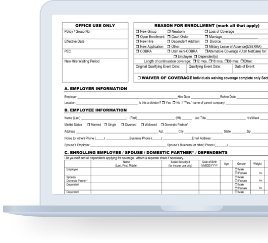
The more information you put on your form, the more burden you put on your customer to sift through that information and process it. It just makes things harder. Think of it as the difference between asking someone one question and letting them answer versus asking them four questions and then asking them to respond to all four. Can it be done? Sure. Does it make for an easier, more fluid conversation? Not so much.
These mental hurdles can cause people to give up. Or decide to do it later, then forget because they found something easier to do.

#UX Insight
Reducing Cognitive Load
Cognitive load is the total amount of mental effort that is required to complete a task. You can think of it as the processing power needed by the user to interact with a product. If the information that needs to be processed exceeds the user’s ability to handle it, the cognitive load is too high.1

There are easy ways to make things easier.
When asking users to give us information, it’s best to consider how little the human brain is capable of recalling at one time. People max out when thinking of 7 things at a time (give or take a few). Anything over that and things starts to feel hard. Simply by breaking up our form into more bite-sized pieces, we can make things feel easier. And the easier things are, the more likely they are to get done.
Let’s look at an example.
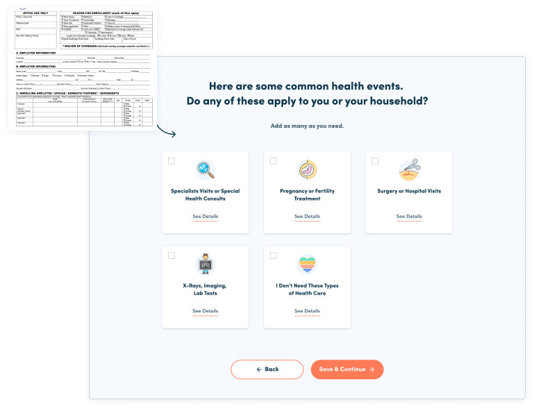
If we look at a complicated health insurance form, we can immediately see one of the reasons a product like MyHealthMath is successful. Using a technique called “chunking” they break a poorly organized form into logical groupings that organize the form for the user instead of the other way around.
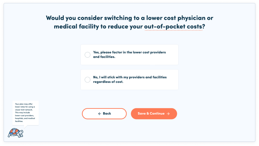
More complicated questions are broken into single screens.
This gives the user the luxury of only having to focus on one thing at a time. They even have a guide in the bottom left (yes, a turtle) to help the user understand complicated ideas.
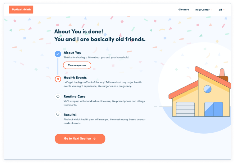
| Success screens confirm users are on the right track. They also let users know what’s coming next. All of this reduces the number of things a user needs to think about over the course of their journey. |

The bottom line.
If your form is too complicated, you need to sit down and simplify it. Ask yourself, what questions are absolutely necessary. If I’m asking a question to gather data, is that data worth the money I may lose to get it.
If you’ve already simplified your form, you may want to consider if it actually feels that way. Getting from 11 pages down to 6 is a great start, but if those six pages are still stacked with questions, you may want to break it up to reduce cognitive load even further.
The bottom line: every time a form is simplified, we see big increases in conversion rates.2
1 https://www.smashingmagazizne.com/2016/09/reducing-cognitive-overload-for-a-better-user-experience/
2 https://www.nngroup.com/articles/conversion-rates/
About the Author
Doug Cooper, based in Austin, is a part of our Design Team as a Product Designer. Over his more than three years at Praxent he’s been bringing numerous ideas to our projects, upscaling our deliverables, and has also been promoting a collaborative environment. His top skills include writing, UX design, user research, and journey mapping. Learn more about Doug here.


Leave a Reply