
4 min read
InsurTech UX Insights – Drive more quotes
PRODUCT INSIGHTS
Get More Quotes
from Your Customers
with One Simple Technique

Doug Cooper
Product Designer at Praxent • 3 minute read
You spent thousands on marketing; crafting the perfect message and identifying the best strategy for your customers. You got them through your sales funnel and to your site ready to get a quote. Then, they take one look at your form and bounce; never to return.
So, what happened?


INDUSTRY
Insurance

CATEGORY
Conversion

UX INSIGHT
Cognitive Load
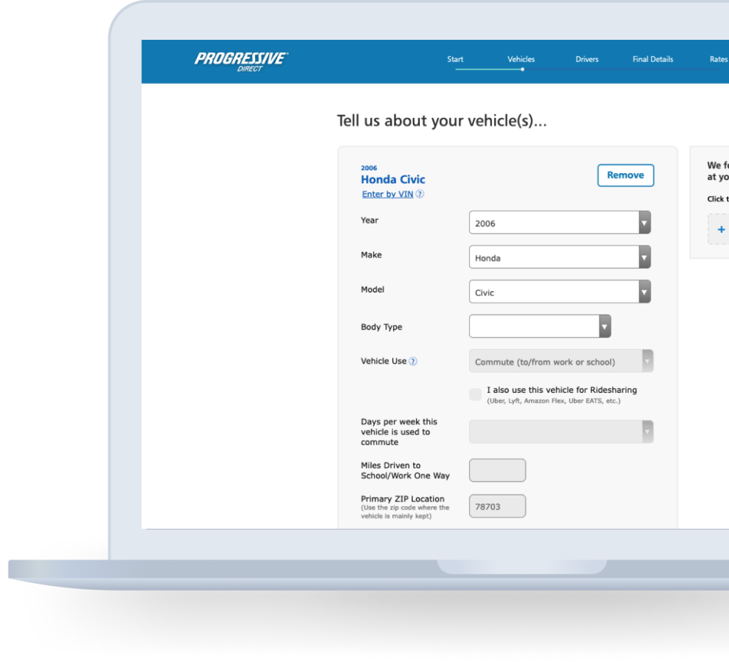
Hard forms get abandoned.
If you’re anything like me, you see a form like this and you start to sweat. It just looks hard. The questions are stacked on top of questions, with the page count at the bottom. Even if I have to fill this out to get the insurance I need, I may look elsewhere to see if an easier alternative exists. This feeling of anxiety could be what’s causing your customers to abandon your process.
Luckily, there’s something we can do to help your customers fill it out while keeping their shirts dry.

#UX Insight
Minimizing Task Perception
The first thing users do when they see a new form is estimating how much time is required to complete it. Separating fields in different steps eases the user’s perception of how hard it is to complete. By doing this, you make the entire process seem much easier to start for your customers.1
Getting started doesn’t have to be so hard.
By breaking up steps and giving your customers a low barrier to entry, you make it easier for them to do the hardest part of any task–start it. Even if your form is longer than your competitors, you can make it feel easier by keeping your customers focused on one step at a time. By starting them off easy, you can influence how they feel about the entirety of the process and still get the information you need to produce accurate quotes and pursue leads.
Let’s look at an example.
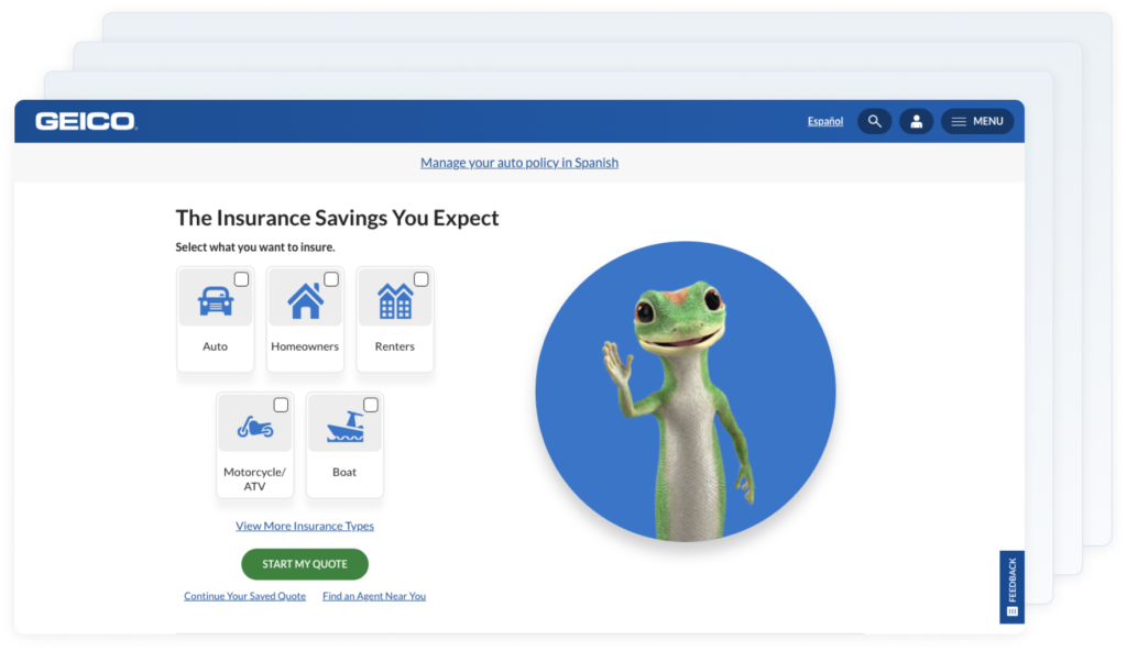
Looking at Geico’s user experience we start to get an idea. Hiding behind this pretty screen is the rest of the form. Because I don’t see it, the whole process feels a lot less daunting.
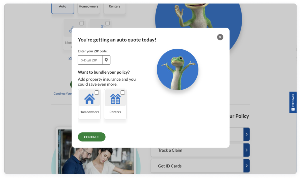
The first question is easy and requires almost no thought at all. Look at that, I’ve already started and I don’t even need to change shirts.
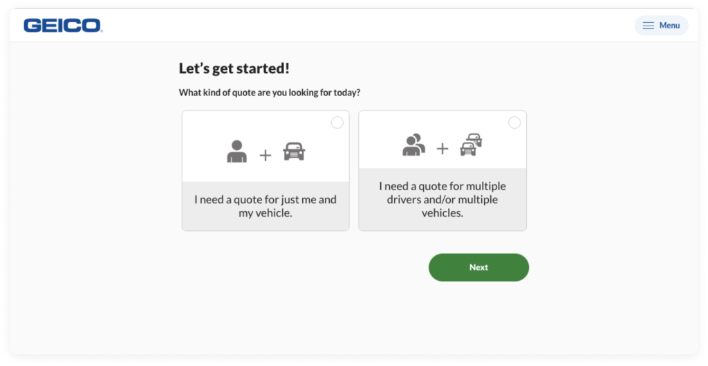
Pictures here make it even easier to make a selection. Get out of here words!
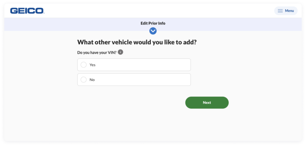
As I move through it stays simple. I don’t have to think much to answer one or two questions at a time. I’m accomplishing something with very little effort! This is the dream!

The bottom line.
Maybe you’ve already gone to a lot of trouble to simplify your form. You got it from 7 pages down to 3. That’s great. But all that work will be for nothing if people perceive it as being complicated at first sight.
Keep your customer’s busy day in mind. The last thing they want to use their mental energy on is filling out an application. By starting them off with simple and clear questions, you’re making a promise to them that you’ve considered their needs and have their best interests in mind.
The bottom line: Minimize the number of fields visible at one time. This creates the perception that the form is shorter than it really is.2
1 https://growth.design/case-studies/tinder-monetization
2 https://www.smashingmagazine.com/2018/08/best-practices-for-mobile-form-design/
About the Author
Doug Cooper, based in Austin, is a part of our Design Team as a Product Designer. Over his more than three years at Praxent he’s been bringing numerous ideas to our projects, upscaling our deliverables, and has also been promoting a collaborative environment. His top skills include writing, UX design, user research, and journey mapping. Learn more about Doug here.


Leave a Reply