
5 min read
InsurTech UX Insights – Solving Quote Abandonment
PRODUCT INSIGHTS
Solving Quote Abandonment
with Intuitive Insurance Copy

Doug Cooper
Product Designer at Praxent • 3 minute read
When a customer calls your customer service number, the last thing you want is them asking questions about why you’re asking them for certain information. Each answer given by one of your customer service representatives eats up valuable time from their day and resources from your company that could be going elsewhere.
Not only that, in a world where customers prefer going digital, it causes them to re-enter the analog. It disrupts their journey through your web application and sometimes they don’t return.
So what can we do to keep them on the right track?


INDUSTRY
Insurance

CATEGORY
Conversion

UX INSIGHT
Cognitive Load
Tough asks go unanswered.
When a question is too complex a user can abandon your application because they don’t understand what you’re asking. When a question contains technical terms that the layman won’t understand, oftentimes the customer won’t be able to give you an answer. Or if a customer finds themself needing materials they don’t have on hand, like an ID or documentation about a previous policy, they will leave and only come back if they have what you need (or maybe not at all).
These are the times when it’s up to us to identify what’s hard for our customers and fill in the gaps for them.
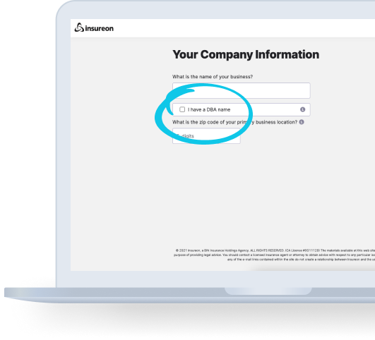

#UX Insight
Briding the Gap
Bridging the gap can be thought of as bridging a literal divide: the more comprehensively we provide assistance to our customers in making it from where they are to where they want to be (i.e. getting an insurance quote), the more people will survive the journey (and continue being users of our applications).
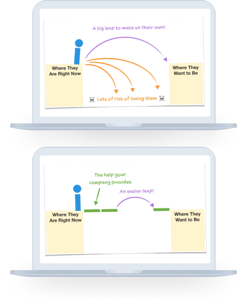
The gap between you and your customers.
When asking our customers to complete the tasks we need them to complete, there is a big difference in what is obvious to us versus what is obvious to them. Getting insurance for a car? Duh, you’ll obviously need the VIN number. Except as a customer, I have no idea why that’s needed and sometimes don’t even know what it is or how to find it. These are the times when we can step in and make sure our customers get across the bridge safely. Before they start, we can tell them they’ll need their vehicle’s VIN number. We can explain why we need it so they don’t feel like they’re privacy is being violated. And we can even show them how to find it on the inside of their car door.
Even better we may be able to avoid asking for the VIN number at all.
Let’s look at an example.
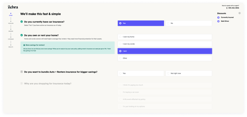
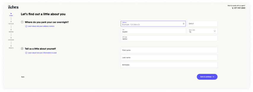
Looking at The Zebra, they consistently provide tips below certain topics to add clarity to questions. These tips tell me what’s possible based on my selections, as well as let me know why certain questions are being asked.
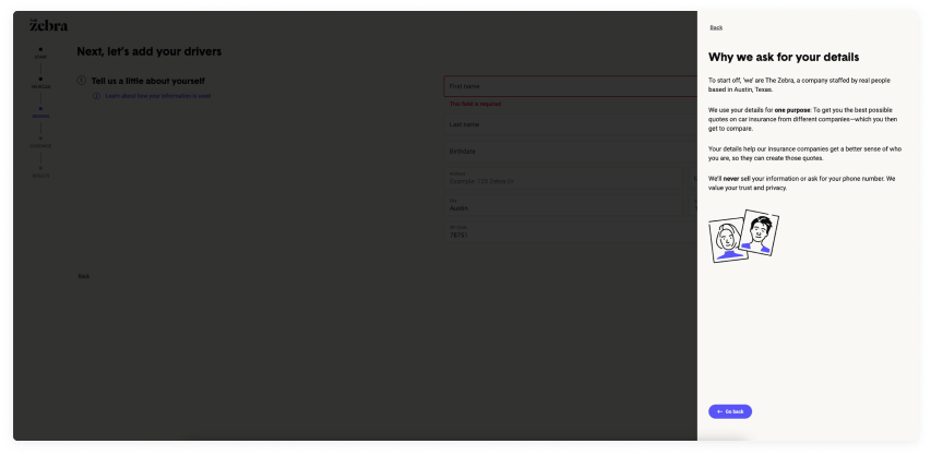
They also provide a help drawer to give me more clarity around any issues they feel may be complex or give me pause.

Finally, they avoid the VIN issue entirely by using data they’ve already gathered to identify a potential match for my vehicle. Now I’ll never learn what a VIN number is!

The bottom line.
The last thing you want is for your customers to abandon your application because they can’t answer something you’re asking them, or don’t want to because you’re not being transparent about the reasons you may need it. Remember, certain data requirements may seem obvious to you from the inside, but your customers might have no idea what it’s used for. Don’t assume they know what you know.
When your customers use your application, you’re making a promise to them that you will get them to where they want to go. Don’t break that promise and leave them hanging because of questions unanswered or obstacles unsolved.
The bottom line: The help your company provides can turn large gaps in your customer experience into simple and easy steps for your customers. And increase conversion in the process!
1 https://www.smashingmagazizne.com/2016/09/reducing-cognitive-overload-for-a-better-user-experience/
2 https://www.nngroup.com/articles/conversion-rates/
About the Author
Doug Cooper, based in Austin, is a part of our Design Team as a Product Designer. Over his more than three years at Praxent he’s been bringing numerous ideas to our projects, upscaling our deliverables, and has also been promoting a collaborative environment. His top skills include writing, UX design, user research, and journey mapping. Learn more about Doug here.


Leave a Reply