
5 min read
InsurTech UX Insights – Best in class insurance app onboarding experiences

Most apps collect digital dust,
yours doesn’t have to

Doug Cooper
Product Designer at Praxent • 3 minute read
Most people don’t use their mobile apps. The majority of them sit on that weird back page of your iPhone with the calculator and a version of Candy Crush you’ve kept since 2012 because you finally made it past level 100. Even worse, a large number get deleted within the first 30 days because the person who downloaded it didn’t think they were worth keeping around.1 If you and your team
spent a few hundred thousand dollars developing a mobile app, this isn’t the outcome you want for your digital child when you send them out into the world.
So what can we do to avoid such a dreadful fate for our mobile apps of the future?


Onboarding experiences underwhelm on average.
One thing we can do is identify where other apps are failing and make sure our app delivers a better experience than its competitors. And luckily for us, about 90% of users think the onboarding experience on a given mobile app could be better.2 That’s a terrible number! And that’s great for us.
Here’s some additional good news: research shows the onboarding experience is directly tied to the perceived value of your app. AND,
that customers who experience a very positive onboarding experience feel a much higher willingness to pay than customers who don’t.3
So what are some tricks and techniques we can use to make our onboarding experience a positive one for our customers?

#UX Insight
Anchoring Bias
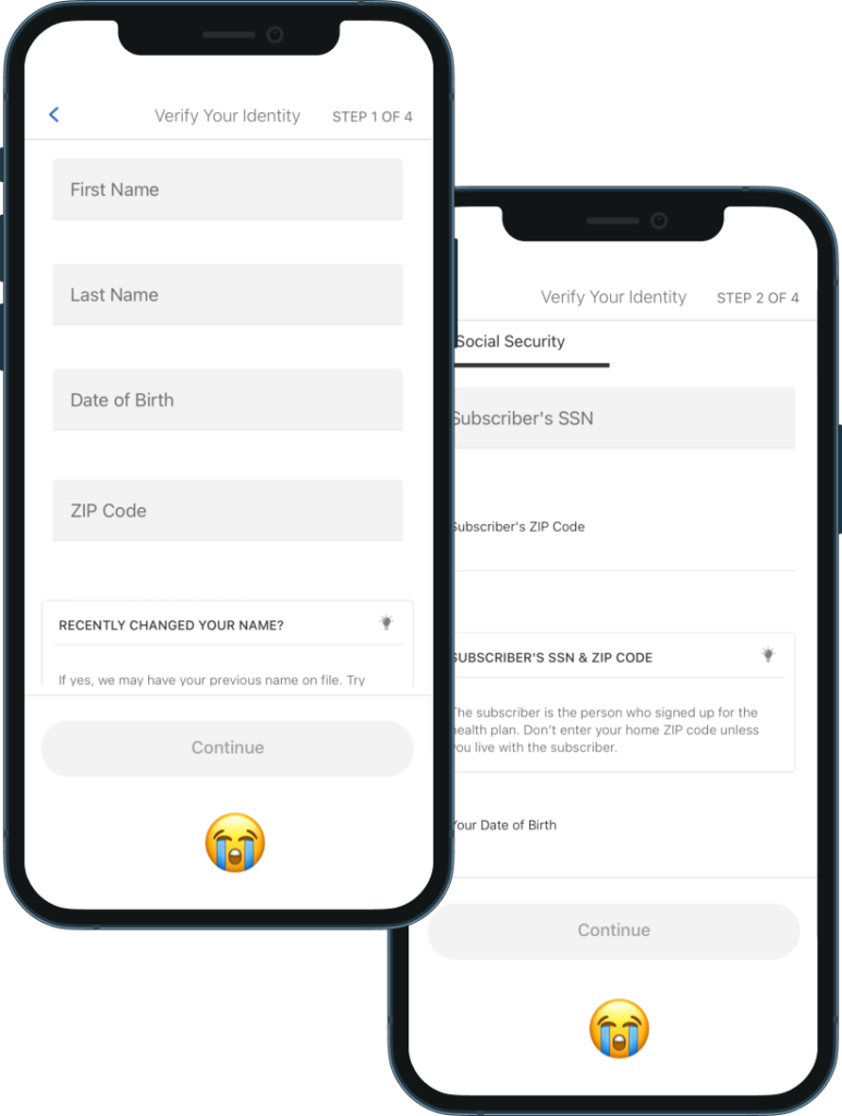
Customers rely heavily on the first piece of information they see. This initial information affects subsequent judgments. Anchoring often works even when the nature of the anchor doesn’t have any relation with the decision at hand. It’s useful to increase perceived value 4.
Create a contract with your customers (and follow-through)
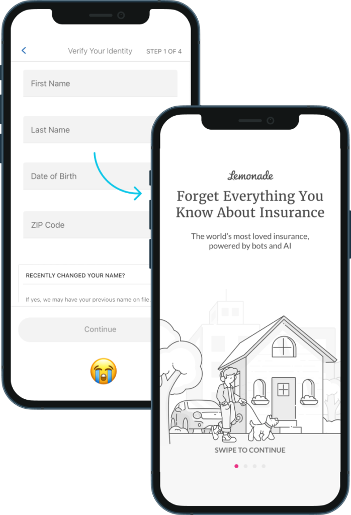
| We can create our anchoring bias (the good kind) with a positive first impression. They say you only get one chance to make one, and as someone who has ruined thousands of interactions in his lifetime, I find this to be true. I also find it to be true for apps. As weird as it sounds, when I open an app I am entering into a sort of digital relationship and as a user, it’s good to know where I stand. Any confirmation I can get upon opening the app to let me know it does what I need it to do, can reinforce the accuracy of my initial decision and make me |
| more willing to complete registration. A lot of times we call these an app’s “Purpose Statement”. A screen that says, “You downloaded me because you wanted to save money on your insurance? Great! That’s exactly what I do.” |
Let’s look at an example.
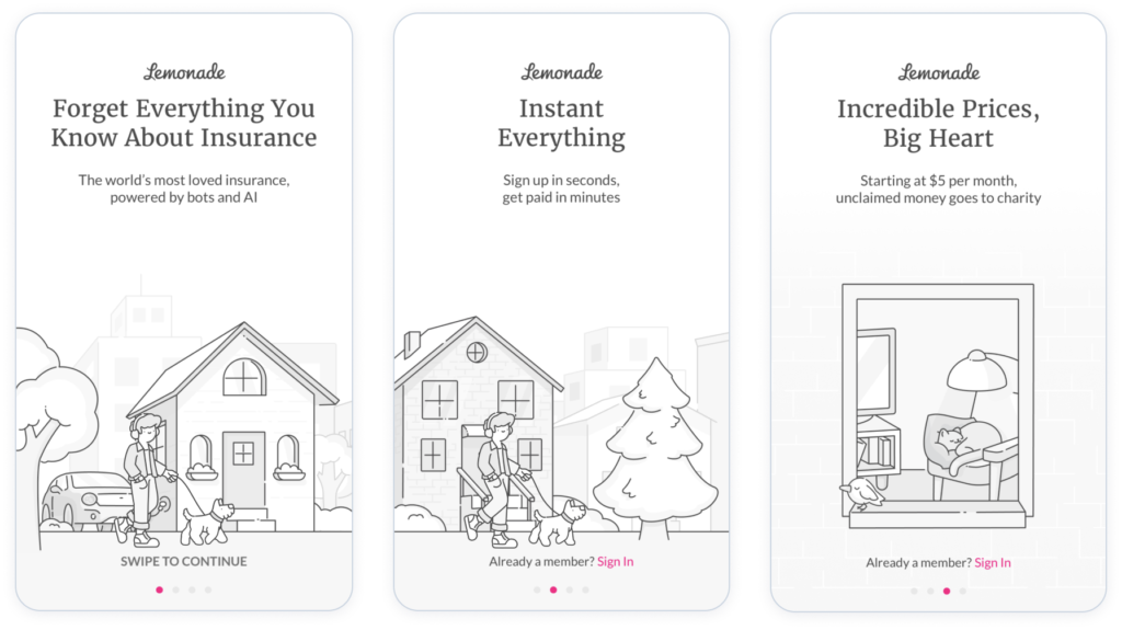
| Lemonade positions its value clearly from the start–as a high-powered tech solution that not only allows you to save money but to send some of those savings toward something that matters to you. |
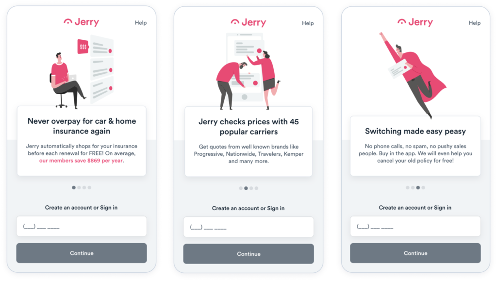
| Jerry positions itself as a way of saving on insurance achieved by different means–by comparing options and helping you choose the best one. It calls out the savings and gives you clues into what the experience will be like. |
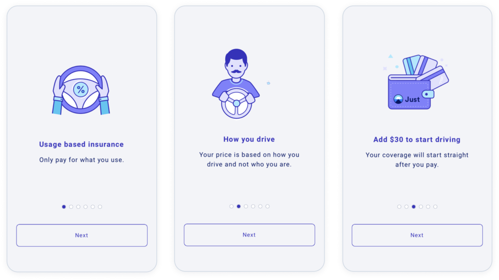
| Finally, Just Insurance positions its value by offering a different business model. One where you pay by distance and usage as opposed to a monthly fee. If I’m someone who rarely drives, I already feel like this could be the most valuable choice for me. |

The bottom line.
When writing a good purpose statement, it’s best not to think of it as just a feature list. Focus less on what your app can do, and more on what your app can do for your customer. By understanding their end goals (Why are they here? What were they trying to achieve?) you can communicate a message that those goals will be accomplished and they’ll be happier than when they started. Maybe it’s saving time by managing their bills online. Maybe it’s reducing stress by filing a claim online. Whatever it may be, by communicating the feature and the outcome, we can confirm with our users that they’re in the right place, and increase the perceived value of our product in the process.
The bottom line: Tell me what your app can do for me and why it will help my life. If you do, the price you’re asking becomes a bargain to most users. And one they’re happy to pay for.
2 https://www.wyzowl.com/onboarding-user-retention/
3 https://www.profitwell.com/recur/all/positive-onboarding-boosts-retention-wtp
4 https://growth.design/psychology#anchoring-bias
About the Author
Doug Cooper, based in Austin, is a part of our Design Team as a Product Designer. Over his more than three years at Praxent he’s been bringing numerous ideas to our projects, upscaling our deliverables, and has also been promoting a collaborative environment. His top skills include writing, UX design, user research, and journey mapping. Learn more about Doug here.


Leave a Reply