A case study by Praxent⌘
Digital transformation
for insurance carrier reduces call center volume by 30%
Enhancing call center efficiency: Texas Mutual’s customer-centric digital overhaul
Texas Mutual is the largest provider of Workers’ Compensation coverage in the state of Texas. They partnered with Praxent to reimagine their website and policyholder portal to drive growth, increase retention, and simultaneously reduce customer service volumes through the deployment of a user-centric strategy.
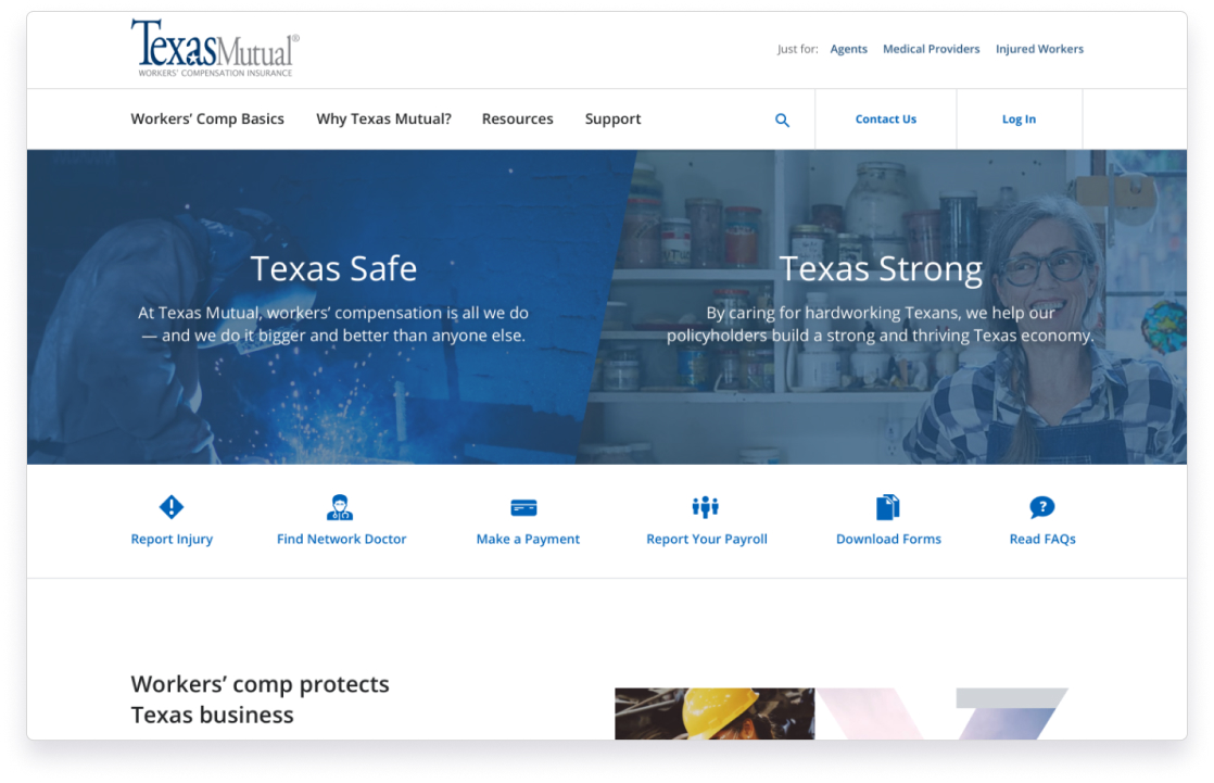
Website
Customer and broker portal
UX Strategy
User Research
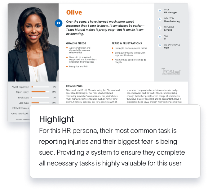
Personas
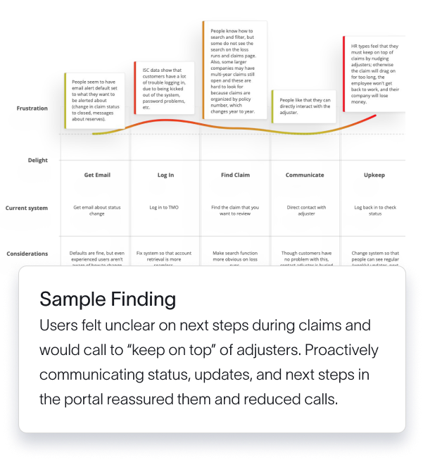
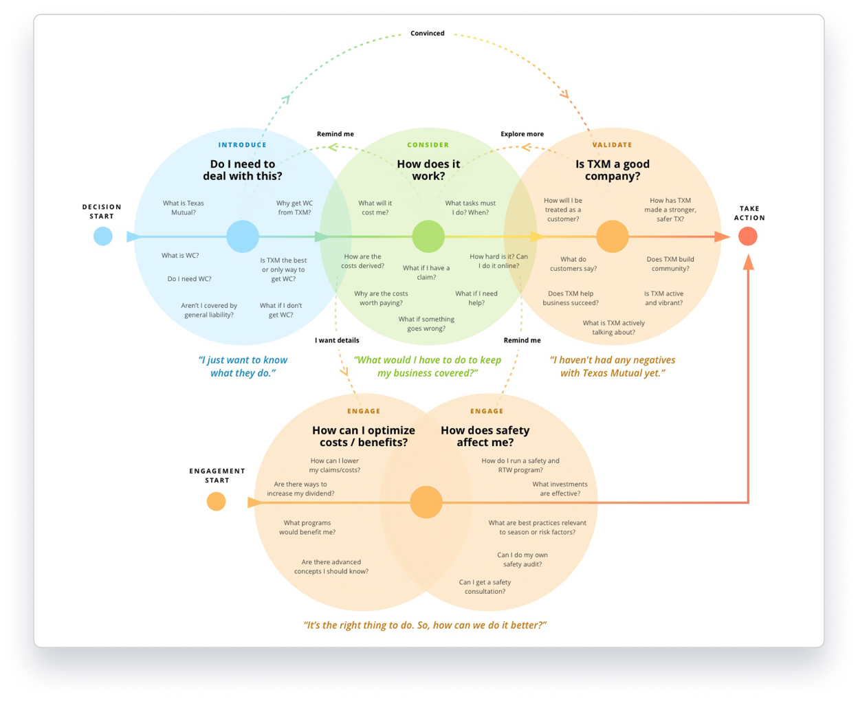
Customer Journey Mapping
Content Architecture
- 30% call center reduction
- Increased Net Promoter Score (80)
- 11% policyholder growth Y/Y (compared to 1% growth the previous year)
- Insurance Business America award: 5* Workers’ Compensation
The challenges
Prospect abandonment
1000s of pieces of content with limited navigation or organization overwhelmed prospects and caused high abandonment rates.

Self-service experience
Poor UX resulted in high customer calling volumes for issues that were explained on the website but were hard to find.
Diverse personas
With so many personas, each with different objectives for visiting the site, organizing the content to create an intuitive experience was challenging.
Limited UX experience
Texas Mutual’s internal team needed more experienced UX strategists than they had in-house and sought a partner to guide and up-skill their team.
The vision for Texas Mutual
Persona-based experience
Knowing each persona’s common tasks, goals, and pain points, to reduce customer service calls, create a user experience specifically designed to meet their needs.
Streamlined navigation
Create a navigation that prioritizes the most commonly used actions for prospects and existing customers. Curated menus targeted to each persona allow for easy access.
Targeted, timely content
Structure the thousands of informational articles by persona and use case to create a content architecture that surfaces the right content at the right time, to the right person.
A partner from end to end
User Research and Personas
Customer Journey Mapping
Content Mapping and Architecture
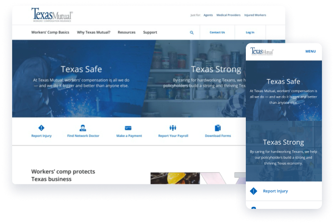
Portal and Website UX Redesign
Future-proof value

We were focused on more than just helping Texas Mutual build a leading digital experience that highlighted their detailed, comprehensive customer service today; we also wanted to equip them with the tools they’d need to continue doing so in the future.
By categorizing their customers into distinct personas, we created a clear framework that guided us in designing a personalized customer experience.

20+ years of experience in UX Strategy, revenue models and digital transformations
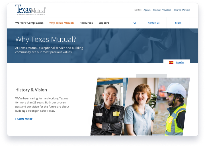
A full-fledged user interface design
30%
call center reduction
Increased Net promoter score (80)
11%
increase in policyholder growth (compared to 1% the previous year)
Address target audiences through a simplified user experience and a more efficient navigation
What Texas Mutual had to say

Ken Ivie
Senior IT Manager Texas Mutual


