A case study by Praxent⌘
Benefits enrollment platform increases pipeline by 300%
Redesigned employee benefits enrollment portal 3Xs revenue in highly regulated industry
Benefit Harbor partnered with Praxent to confront the challenges of an outdated and intricate employee benefits platform in the regulated employee benefits sector, burdened by layers of data and cumbersome processes.
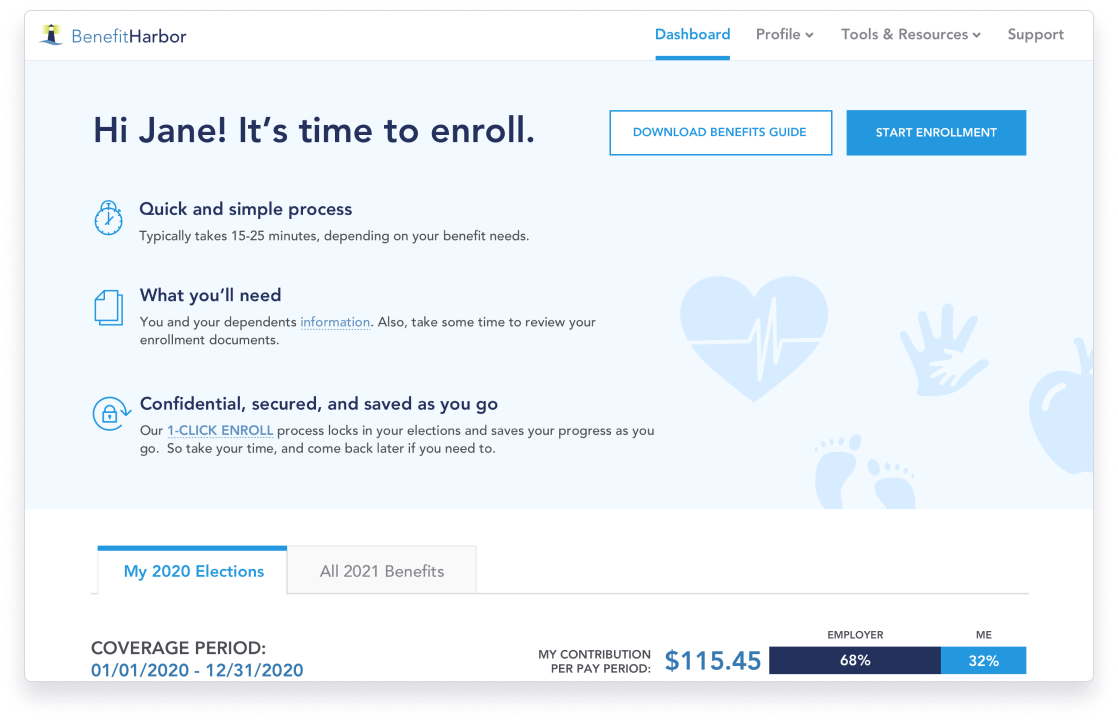
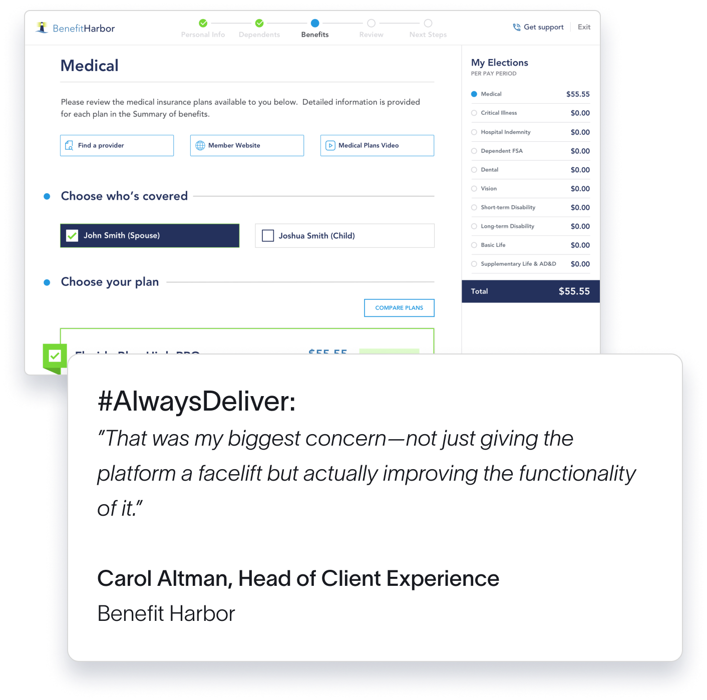
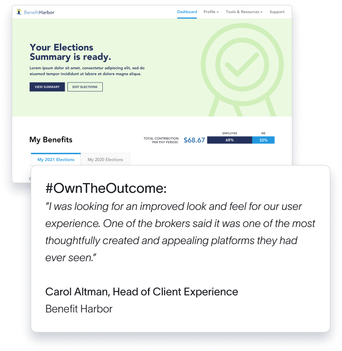
- Employee Benefits Enrollment Wizard
- Administrator Dashboard
- 1-Click Enroll
- Integrated Assistance Information
- Plan Comparison
- Contribution Calculator
- 300% increase in sales pipeline in 3 months
- 15-20 minutes enrollment processing time, down from a full day
- 70% average cost savings on new hire enrollment
- 23% increase in enrollment participation
The challenges
Compliance vs UX
The platform was burdened by disclaimers and eligibility questions mandated by strict insurance regulations. It created a confusing user experience for employees.
Unrealized revenue potential
Users rolled-over their benefits without exploring options impacting utilization because employees lacked awareness of the products available to them.
Broker impact
As employees struggled to enroll in their benefits, brokers were often forced to spend time supporting customers during open enrollment.
Dated user experience
The legacy platform looked dated and was unintuitive to use which impacted new client acquisition despite the market-leading technical capabilities powering it.
The vision for Benefit Harbor
Benefit Harbor wanted to reimagine their platform as an engaging self-service experience offering an intuitive and personalized experience, presenting crucial information at the time of need for informed decision-making.
Most importantly, they wanted a platform that would compete in the market as an industry-leading enrollment experience.
A partner from end to end
UX Audit
User Research
User Personas
UX Strategy
Branding
ClickModel® Prototype
Frontend Development
Launch
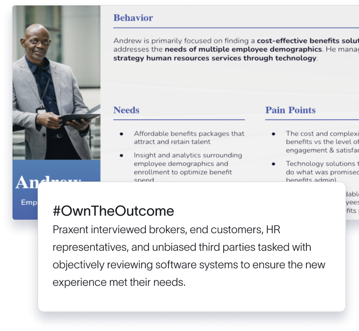
User Research and Personas
Praxent conducted an onsite 5-day design sprint and after completing over 15 interviews, was able to work on stakeholder alignment, identify use cases, and created workflows and site maps to visualize what needed to be included and how the components of the system related to one another.
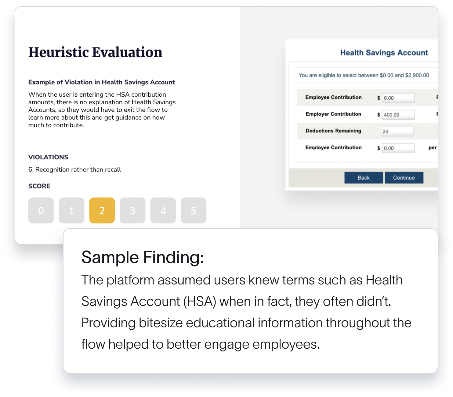
Heuristic Evaluation

The team at Praxent told me the top five things we should be doing to improve user experience. They listed major, high-impact things but also low-hanging fruit that could be fixed without pulling everything out by the roots and starting over again.

A market-leading enrollment platform
3X
REVENUE GROWTH
23%
INCREASE IN ENROLLMENT PARTICIPATION
15-20
minutes enrollment processing time, down from a full day
70%
AVERAGE COST SAVINGS ON NEW HIRE ENROLLMENT
Seamless integration with the backend system and processes
What Benefit Harbor had to say

Carol Altman
Head of Client Experience, Benefit Harbor


